


Mapstermind
Lead Designer | UI/UX Designer | Product Owner
Asymmetrical Party Game (UE4)
Sep 2021 - May 2022
Team Size: 16
Mapstermind is a 2 - 4 player asymmetrical party game, made as a capstone project during my senior year at Champlain College. In the game, one player assumes the role of the "Mapster" who uses traps and attacks in an effort to prevent the other players, the "Piecelings", from completing tasks and escaping the stage.
Game Trailer
Design Reel
Design Challenge: Cultivating A Board Game Experience
Since its inception, my approach to designing Mapstermind's gameplay and menu UI elements began with the desire to deliver an unobtrusive player experience. This meant finding a way to make these UI elements diegetic so as to maintain player immersion in-game and in menus. After the game's premise had become solidified by the team, my focus then switched to perpetuate the feeling of playing on a game board, and figuring out how these diegetic gameplay and menu elements would look.
One of the first diegetic UI elements that I created was in response to early testers' feedback, showing that we didn't make it apparent enough whenever a Pieceling completed a task. This was made clear through QA by more than half of the testers stating that task completion was not clear.

Unapparent
Apparent
Initial Task Clarification QA Data
Due to Mapstermind being in the beginning stages of development at this point, all that players had to track Pieceling progress was an overlay UI element implemented by programmers as a placeholder. Out of the way in the screen's upper left corner, this small UI element led players to become confused as to the state of the game due to the lack of overall player feedback.
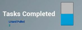
Initial Task Completion Bar
In response, my solution was to utilize Blender and Illustrator to come up with a diegetic task indicator asset that made completing a task as clear as possible while maintaining the board game aesthetic. These assets would start out with a prominent exclamation mark on the face of the center circle along with a red indicator light on top. Upon task completion, the center circle would flip around to reveal a clearly marked green check, a ding sound effect would play, and the light would change from red to green.

Diegetic Task Indicator
In practice, these task indicators were placed above all of the locations on the stage where Piecelings had a task to complete. In comparison to what was present in the previous build QA build, the blockout scene in which I placed the task indicators was already becoming more clear in relation to the clarity of Pieceling tasks.

Task Indication Comparison Photos
The subsequent QA session's results showed that more than half of testers who played with these new task indicators expressed that they better understood when they completed a task.
New Indicator QA Data
